Style & Context
Influences
Kitchen sink realism, British New Wave cinema, documentary photography
Location
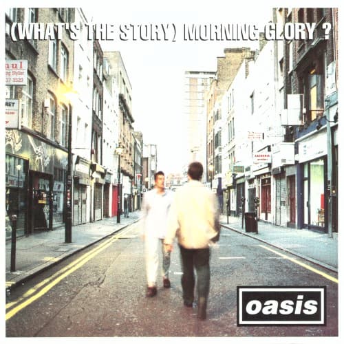
The Northern English architecture speaks to Oasis's Manchester roots and regional pride that fueled Britpop's appeal.
Visual Language
The handheld aesthetic channels the gritty social realism that Britpop inherited from 1960s British cinema.
Symbols
Motion blur on figures
The blur captures Britpop's velocity as Oasis rocketed from obscurity to stadiums within months.
Walking away from camera
The Gallagher brothers reject traditional rock star posturing, maintaining studied indifference to their impending fame.
Empty morning street
The vacant road represents the blank canvas before Oasis conquered British rock and cleared the path ahead.
Where Sound Meets Image
The motion and forward momentum visually echo the album's anthemic drive, particularly the charging guitars of 'What's the Story Morning Glory' and 'Morning Glory.' The empty street mirrors the isolation explored in 'Don't Look Back in Anger' and 'Wonderwall'—songs about connection sought amid urban loneliness. The blurred anonymity reflects how the Gallaghers wrote universal anthems from personal specifics, turning their Manchester experience into songs millions claimed as their own. The stark daylight honesty matches the album's straightforward rock approach, rejecting studio trickery for raw power.
The cover established street photography as Britpop visual language, influencing countless indie rock releases throughout the late 90s. Its anti-glamour stance became template for bands positioning themselves as authentic alternatives to manufactured pop. The image remains shorthand for mid-90s British rock, reproduced on retrospectives and best-of-decade lists, proving that ordinariness carefully framed can achieve more lasting impact than elaborate concepts.
![[Led Zeppelin IV] by Led Zeppelin album cover](/_next/image?url=https%3A%2F%2F44shyya1tglz2lc3.public.blob.vercel-storage.com%2Fcovers%2Fled-zeppelin-led-zeppelin-iv.jpg&w=640&q=75)