Style & Context
Influences
Walker Evans, FSA Depression photography, tabloid crime documentation
Location
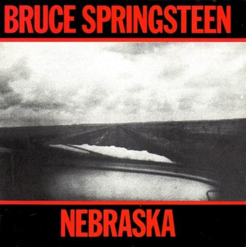
This cover appeared when MTV demanded colorful spectacle, making its stark minimalism a deliberate rejection of early-80s excess.
Visual Language
The deliberately degraded image quality matches the album's four-track recording, both choices rejecting polish in favor of raw documentary truth.
Symbols
Empty highway
The road represents broken American promises, leading nowhere except deeper into forgotten territories and failed dreams.
Storm clouds gathering
Darkness accumulates on the horizon, reflecting the criminal violence and economic desperation explored throughout the album's narratives.
Absence of human figures
The unpopulated landscape mirrors the isolation of Nebraska's characters, people cut off from community and salvation.
Where Sound Meets Image
The degraded photographic grain perfectly mirrors the cassette-recorded hiss that permeates every track, both visual and sonic textures embracing lo-fi imperfection as authenticity. The empty highway connects directly to songs about drifters, criminals on the run, and characters fleeing failed lives—from the murderer Charles Starkweather driving across this very state to the narrator of 'State Trooper' pleading not to be pulled over on the New Jersey Turnpike. The absence of Springsteen's face or any human presence reflects the E Street Band's complete absence from the recording, just one man and his guitar confronting American darkness without a safety net.
This cover established that major artists could reject commercial packaging entirely in favor of documentary starkness, influencing decades of alternative and indie rock aesthetics. The minimal design became a template for serious singer-songwriters choosing authenticity over marketability—from Steve Earle to Jason Isbell, artists have returned to this stark visual language when addressing hard American truths. Photography of empty landscapes became shorthand for roots rock credibility, while the combination of brutal typography with degraded black-and-white imagery defined a visual vocabulary for examining working-class struggle that persists in album art today.
![[Led Zeppelin IV] by Led Zeppelin album cover](/_next/image?url=https%3A%2F%2F44shyya1tglz2lc3.public.blob.vercel-storage.com%2Fcovers%2Fled-zeppelin-led-zeppelin-iv.jpg&w=640&q=75)