Style & Context
Influences
Punk zine aesthetic, shock advertising, documentary realism
Location
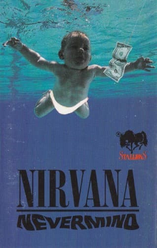
This cover visualized the exact contradiction alternative bands faced when signing to major labels.
Visual Language
The snapshot quality deliberately rejects polished commercial photography while functioning as brilliant commercial photography.
Symbols
Dollar bill on fishhook
Capitalism literally baits human beings from birth, turning natural instincts into commercial transactions.
Infant's nakedness
Pre-socialized humanity exists briefly before consumer culture claims every aspect of identity and desire.
Underwater environment
Submersion represents the suffocating medium of American materialism that surrounds and penetrates everything.
Where Sound Meets Image
The underwater disorientation mirrors the album's dynamic shifts between quiet verses and explosive choruses. Kurt Cobain's lyrics obsessed over the corruption of innocence, childhood trauma, and how consumer culture poisons authentic experience—themes this image captures without words. Songs like 'In Bloom' and 'Breed' examine how people get shaped by forces they don't understand, exactly what the swimming infant represents. The clinical quality of the water matches the album's clean production, which scandalized punk purists who expected lo-fi murk.
This cover established that alternative rock could be visually provocative without resorting to fantasy art or band photography. It proved that conceptual simplicity could sell millions while maintaining artistic credibility. Every subsequent alternative band faced the question of whether their cover could achieve this level of immediate visual communication. The image transcended music entirely, becoming shorthand for 1990s youth culture in museum exhibits and academic studies.