Style & Context
Influences
Robert Frank, William Eggleston, vintage postcard aesthetics, noir cinematography
Location
This captures Los Angeles as the entertainment industry transformed artistic rebellion into profitable lifestyle branding.
Visual Language
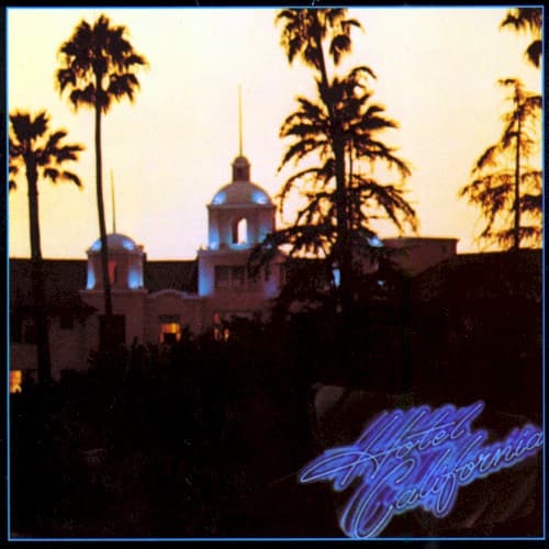
The deliberately hazy focus creates dreamlike unreality that matches the album's hallucinatory narrative perfectly.
Symbols
Palm trees silhouetted
These iconic California symbols stand as dark sentinels rather than tropical paradise markers, suggesting beauty corrupted.
Illuminated windows
The lit rooms suggest occupied luxury suites where guests check in but spiritually never leave.
Spanish colonial architecture
The mission-style building represents Old California dreams now converted into commercial fantasy and tourist spectacle.
Where Sound Meets Image
The visual perfectly mirrors the title track's narrative of a weary traveler drawn to a seductive but sinister destination. The warm inviting glow matches the song's welcoming voices and Mercedes bends, while the darkening sky foreshadows the realization that you can check out but never leave. The colonial architecture connects to the album's themes of manifest destiny turned cancerous, while the neon script echoes the slick production values that made the Eagles' critique of commercialism so commercially successful.
This cover established the template for presenting California as beautiful corruption rather than golden opportunity. Its influence appears in countless album covers and film posters that use similar twilight palettes to suggest nostalgia mixed with dread. The floating neon typography became a signature move copied by designers trying to evoke seventies decadence, while the soft-focus aesthetic helped define the visual language of classic rock's most introspective era.