Style & Context
Influences
Francis Bacon, Edvard Munch, medical illustration, German Expressionism
Location
Released as progressive rock emerged from psychedelia's ashes, the cover announced a new seriousness and artistic ambition in rock music.
Visual Language
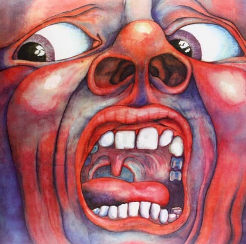
Godber's technique combines painterly fluidity with precise anatomical knowledge, creating something both artistic and visceral that rejected rock's commercial polish.
Symbols
Wide-open screaming mouth
The gaping maw reveals vulnerability and primal terror, challenging rock's typically confident postures with raw emotional exposure.
Asymmetrical facial features
The distorted proportions suggest a face caught mid-transformation, reflecting progressive rock's rejection of conventional song structures and predictable patterns.
Visible tongue and throat
The exposed interior anatomy strips away social masks, mirroring the album's refusal to hide technical complexity behind commercial accessibility.
Where Sound Meets Image
The screaming face directly mirrors the album's sonic intensity, particularly the distorted vocal passages and Greg Lake's dramatic delivery on the title track. The anatomical detail reflects the music's technical precision and complex time signatures, while the disturbing quality matches Robert Fripp's dissonant guitar work and the jarring shifts between beauty and chaos. The exposed vulnerability of the scream parallels the album's willingness to move from delicate mellotron passages to crushing proto-metal riffs without warning, demanding listeners abandon expectations of verse-chorus comfort.
This cover established that progressive rock albums could function as art objects worthy of gallery consideration, influencing countless bands to commission similarly ambitious and unsettling artwork. The image remains instantly recognizable five decades later, appearing on t-shirts, posters, and countless homages. Storm Thorgerson and Hipgnosis likely drew inspiration from its willingness to disturb rather than merely decorate. The cover proved rock albums could challenge viewers visually just as the music challenged listeners sonically, elevating album packaging from marketing tool to integral artistic statement.