Style & Context
Influences
punk flyers, concert photography, protest imagery, counterculture posters
Location
Seattle's flannel-clad rebellion against LA's Sunset Strip found its visual language in this stripped-down, emotionally direct image.
Visual Language
The rough composite technique rejects slick 80s production values while maintaining enough visual punch for record store racks.
Symbols
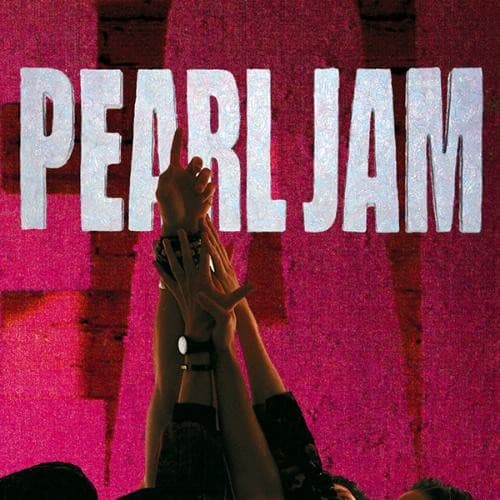
Raised hands in silhouette
The gesture captures both worship and desperation, reflecting the album's themes of isolation seeking connection.
Multiple exposure layering
The overlapping images mirror the psychic fragmentation explored in songs like Jeremy and Why Go.
Distressed typography bleeding through
The weathered lettering suggests authenticity and DIY ethos rejecting hair metal's polished gloss.
Where Sound Meets Image
The visual chaos mirrors the album's wall of sound production, where multiple guitar tracks and Vedder's yearning vocals create dense emotional landscapes. The reaching hands visualize the desperate connection-seeking in Alive and Black, while the layered exposures match the album's themes of fractured identity and buried trauma. The stark contrast between light and shadow reflects the music's dynamic range, from whispered verses to explosive choruses.
This cover helped establish grunge's visual vocabulary of authenticity through roughness, influencing a decade of alternative rock packaging that rejected gloss for grit. The template—band name, single striking image, distressed treatment—became shorthand for serious rock credentials in the 90s and beyond.