Style & Context
Influences
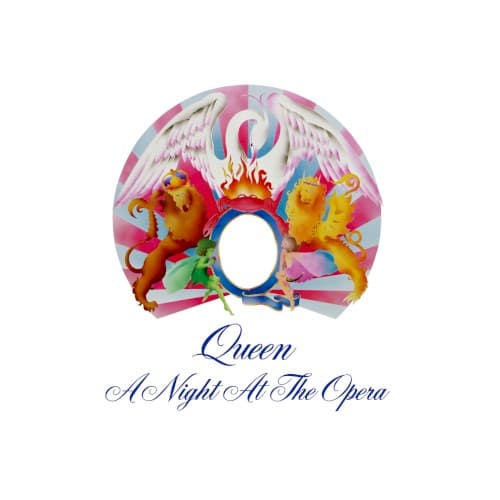
Royal coat of arms, art nouveau flourishes, psychedelic poster art
Location
This crest emerged from the same London studio scene that valued technical prowess over three-chord simplicity.
Visual Language
The design merges Edwardian pageantry with the saturated palette of San Francisco concert posters from a decade earlier.
Symbols
Flanking lions
The twin beasts in clashing colors represent the band's dual nature as classical musicians and hard rock provocateurs.
Central empty oval
The void invites listeners to place themselves within Queen's theatrical universe rather than worship distant rock gods.
Flame crown
Fire atop the crest signals the volatile energy contained within six operatic sides of vinyl experimentation.
Where Sound Meets Image
The crest's theatrical excess directly mirrors the album's genre-hopping ambition across opera pastiches, music hall romps, and hard rock anthems. The empty center oval functions like the pause before Bohemian Rhapsody's operatic section, a moment of anticipation before chaos erupts. The dual-colored lions capture the tension between Brian May's orchestral guitar layers and Roger Taylor's primal drumming, while the scrollwork suggests the baroque piano runs threading through multiple tracks.
This cover established visual shorthand for progressive rock's maximal tendencies that persists in fantasy metal artwork and theatrical rock branding. The crest format influenced how bands could claim lineage and authority through heraldic imagery without literal crowns or thrones. Its refusal of photographic realism helped legitimize illustration as equally valid to the performance shots dominating mid-seventies rock packaging.