Style & Context
Influences
Film noir cinematography, Blue Note jazz photography, 1970s minimalist design
Location
The cover rejects stadium rock's visual excess for the private listening experience.
Visual Language
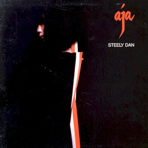
The severe lighting creates sculptural depth from minimal information, echoing the album's dense arrangements.
Symbols
Vertical amber light stripe
The single illuminated edge represents Steely Dan's razor-sharp perfectionism cutting through rock's indulgence.
Obscured facial features
The deliberately hidden face embodies the duo's refusal to embrace rock star celebrity culture.
Hand-drawn 'aja' script
The casual orange lettering contrasts the formal composition, suggesting jazz improvisation within rigid structure.
Where Sound Meets Image
The concealed figure perfectly embodies the album's oblique storytelling and emotional distance. Just as the music layers complex chord progressions beneath smooth surfaces, the photograph hides detail in shadow while suggesting depth. The amber accent echoes the warm horn arrangements on tracks like 'Deacon Blues,' while the overwhelming darkness matches the album's themes of disillusionment and detachment. The minimalist approach reflects how Fagen and Becker stripped down their band to focus on studio precision, using session musicians rather than touring lineups.
This cover helped establish visual minimalism as a marker of musical sophistication in rock. The photograph influenced countless jazz-rock and adult contemporary albums that followed, proving that mystery could sell better than spectacle for certain audiences. Its restraint anticipated the stark aesthetics of post-punk and new wave, showing that serious music didn't need serious visual statements.