Style & Context
Influences
Playboy aesthetic, burlesque photography, exploitation cinema promotional materials
Location
This image reflected Swinging London's media image more than the actual psychedelic community's artistic values or vision.
Visual Language
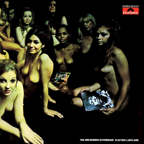
The clinical lighting and staged poses reveal commercial photography meant to shock rather than explore artistic nudity.
Symbols
Nineteen nude women
The sheer number transforms individual bodies into a collective spectacle of late-sixties sexual revolution commodification.
Direct eye contact from subjects
Several women stare directly at the viewer, creating uncomfortable confrontation rather than passive objectification.
Black void background
The absence of context or environment strips the image of psychedelic meaning, leaving only bare provocation.
Where Sound Meets Image
The cover completely fails to represent Electric Ladyland's sonic ambition, its studio experimentation and blues-funk-psychedelia fusion buried beneath gratuitous flesh. Hendrix's extended guitar explorations, multi-tracked sound sculptures, and spiritual jazz influences deserved the abstract cosmic imagery he requested, not this tabloid-ready spectacle. The disconnect between the album's sophisticated musicianship and this reductive marketing ploy became a cautionary tale about artistic control. The music ventures into uncharted sonic territory while the sleeve traffics in the oldest marketing trick available.
This cover's legacy is primarily negative, representing everything artists fought against in the corporate rock era. It accelerated musicians' demands for creative control over their visual presentation and became exhibit A in arguments about exploitation versus expression. The controversy ensured Hendrix and most subsequent pressings used his preferred abstract cover, making this version a collector's curiosity rather than the definitive image. Its infamy overshadowed its actual visual impact, teaching the industry that shock value without artistic merit damages rather than enhances a release.