Style & Context
Influences
Social realism photography, British kitchen sink cinema, punk album aesthetics
Location
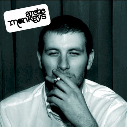
The image captures Sheffield's council estate youth culture, where pubs and taxi queues defined weekend social rituals.
Visual Language
The unfussy composition recalls documentary photography that captured British working-class life with unvarnished directness and authenticity.
Symbols
Lit cigarette
The cigarette represents the casual rebellion and working-class British pub culture central to the album's narratives.
Direct eye contact
The subject's unflinching gaze challenges the viewer, mirroring the band's confrontational lyrical honesty about youth culture.
White dress shirt
The rumpled formal shirt suggests the aftermath of a night out, caught between respectability and dissolution.
Where Sound Meets Image
The cover's documentary realism matches Alex Turner's lyrical reportage from Sheffield nightlife. Songs like 'I Bet You Look Good on the Dancefloor' and 'When the Sun Goes Down' capture the same unvarnished moments this photograph freezes. The subject's exhausted-but-present expression mirrors the album's tales of nights that blur into mornings, where bravado gives way to cigarette breaks and taxi rides home. The monochrome treatment reflects the album's stripped-down garage rock production, rejecting studio gloss for raw energy.
This cover helped establish visual authenticity as the aesthetic currency of 2000s indie rock. Its snapshot intimacy influenced countless bands to abandon stylized photoshoots for candid documentary images. The design's simplicity—just a photograph and a logo sticker—became a template for indie credibility. Decades later, the cover remains instantly recognizable, its unposed realism more enduring than the calculated imagery of more polished contemporaries.