Style & Context
Influences
Constructivism, Swiss Design, Kraftwerk's minimalism, scientific journals
Location
Factory Records' Manchester aesthetic privileged high-concept design over commercial appeal, treating sleeves as gallery-worthy objects.
Visual Language
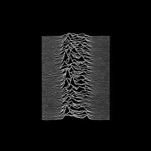
Saville transformed astronomical research into pure graphic abstraction, treating the album as conceptual art rather than product.
Symbols
Radio pulsar waveforms
The unknowable cosmic pulse represents communication from dying stars, echoing Curtis's fascination with entropy and distance.
Vertical stacking pattern
The rhythmic repetition of displaced waves mirrors the mechanical precision of Stephen Morris's drumming throughout the album.
Absence of band name
The anonymous presentation reflects post-punk's rejection of rock star ego and commercial packaging conventions.
Where Sound Meets Image
The cover's repetitive waveforms directly parallel the album's motorik rhythms and Peter Hook's throbbing basslines. The black void surrounding the pulsar data mirrors the cavernous space in Martin Hannett's production, where instruments echo in isolated channels. The mathematical precision of the lines reflects the band's disciplined restraint—Curtis's baritone monotone, the locked-groove bass-and-drums of 'She's Lost Control,' the mechanized dread of 'Disorder.' The cover is as austere and uncompromising as the music itself.
This became the blueprint for indie rock's obsession with minimalist, text-free album art. Its influence spans from The xx's sparse geometry to LCD Soundsystem's monochrome austerity. The image transcended the album to become streetwear ubiquity—worn by millions who've never heard the record. It proved that rigorous conceptual design could become mass culture, and that stripping away commercial elements could create the most commercially enduring image in post-punk history.