Style & Context
Influences
Helmut Newton, Guy Bourdin, provocative fashion photography, punk zine aesthetics
Location
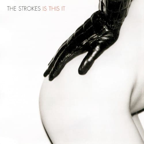
The cover reflects Lower East Side art-school sophistication meeting deliberate crude simplicity and boundary-pushing provocation.
Visual Language
The clinical framing recalls fashion editorial work while rejecting its polish for garage rock's stripped-down honesty.
Symbols
Black leather glove
The glove suggests control, distance, and the tactile exploration central to garage rock's physical energy.
Cropped framing
Deliberate cropping removes context and identity, focusing purely on gesture and surface contact.
White negative space
The vast emptiness emphasizes isolation and the spare aesthetic of the band's lo-fi approach.
Where Sound Meets Image
The cover's clinical intimacy mirrors the album's lo-fi production aesthetic, where guitars sound like they're played through cheap amps in small rooms. The provocative minimalism reflects songs like 'Soma' and 'Barely Legal' that address desire with deadpan detachment. The stark composition matches the band's rejection of rock bombast for tight, economical songwriting where nothing is wasted.
This cover helped establish the visual language of 2000s indie rock: provocative yet minimal, sophisticated yet deliberately crude. The controversy demonstrated that album art could still shock in the digital age, influencing bands like Arctic Monkeys and Interpol to embrace stark, confrontational imagery. The alternate cover featuring particle collision patterns became equally famous, showing how censorship creates dual legacies.