Style & Context
Influences
Warhol's Campbell's Soup series, commercial advertising, Dadaist ready-mades, package design
Location
The cover emerged from Warhol's Factory on East 47th Street, where artists, drag queens, socialites, and musicians created New York's most transgressive creative laboratory.
Visual Language
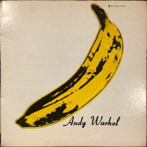
Warhol applies his signature method of elevating everyday objects into art, stripping the banana of natural context to create pure iconic form.
Symbols
Bruised banana
The fruit's imperfections visualize themes of corruption, decay, and the transient nature of pleasure central to songs like 'Heroin' and 'Venus in Furs.'
Warhol's signature
The artist's name claims authorship while positioning the band within his Factory scene's blend of art, commerce, and counterculture rebellion.
Peel-away sticker
The original vinyl's peelable banana revealed pink flesh beneath, literalizing the album's unveiling of New York's hidden sexual and narcotic underworld.
Where Sound Meets Image
The cover's visual simplicity mirrors the band's stripped-down arrangements that rejected psychedelic excess for droning guitars and deadpan vocals. The banana's suggestive shape and Warhol's knowing irony reflect songs addressing taboo sexuality, S&M dynamics, and drug culture with clinical directness rather than hippie mysticism. The cover's commercial veneer masking transgressive content parallels how Lou Reed's conversational delivery concealed genuinely shocking subject matter. Just as the banana sticker peeled away to reveal pink flesh, the album's accessible pop structures gradually exposed Manhattan's underground demimonde.
The banana established that rock albums could function as gallery-worthy art, influencing decades of minimalist cover design from Joy Division to The White Stripes. Warhol's conceptual approach—where the artist's signature carries equal weight to the band name—set precedent for designer-driven album art. The cover's instant recognizability without text or band imagery proved that pure visual symbols could define musical identity, a strategy countless bands have attempted but rarely equaled.