Style & Context
Influences
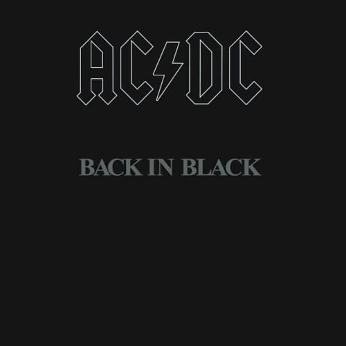
Funeral announcements, Black Sabbath's self-titled debut, minimalist corporate design
Location
Atlantic Records typically favored colorful, attention-grabbing designs, making this restrained approach a commercial gamble that paid off massively.
Visual Language
The embossing creates subtle dimensionality that only reveals itself when light hits the surface at certain angles.
Symbols
Total blackness
The void represents both mourning for Bon Scott and the band's refusal to fade away after his death.
Outlined band logo
The hollow letters suggest emptiness while maintaining architectural strength, mirroring the band's emotional state.
Lightning bolt in logo
The iconic electricity symbol cuts through the lettering, representing raw power that persists despite loss.
Where Sound Meets Image
The visual austerity mirrors the album's production approach, which featured cleaner, more precise guitar tones than previous AC/DC records. The black background reflects the album's darker emotional undercurrent beneath songs like 'You Shook Me All Night Long' and 'Hells Bells,' which opens with funeral bells. The architectural strength of the outlined logo matches the structural precision of the riffs throughout. The void surrounding the text creates space that the massive guitar sound fills, suggesting volume and power without depicting it.
This cover redefined hard rock packaging by proving minimalism could outsell elaborate artwork. It established black as the default color for credibility in heavy music, influencing everyone from Metallica to The Black Keys. The design's reproducibility made it perfect for bootleg merchandise, paradoxically strengthening its cultural penetration. Decades later, the image remains instantly recognizable even at thumbnail size, a test many elaborate covers fail.