Style & Context
Influences
Expressionist film noir, Victorian mourning photography, surrealist double exposures
Location
This visual directly challenged MTV's preference for literal storytelling and bright color saturation standards.
Visual Language
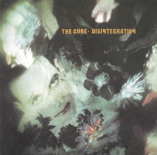
The layered photographic technique creates depth through transparency, making solid forms appear spectral and unstable.
Symbols
Wilting flowers
Natural beauty in decline mirrors the romantic relationships crumbling throughout the album's narratives.
Multiple exposures
Overlapping faces suggest fractured identity and the psychological fragmentation Smith explores across these songs.
Reaching hands
Gestures frozen mid-reach convey desperate grasping for connection that remains eternally out of grasp.
Where Sound Meets Image
The overlapping exposures directly parallel the album's dense, layered production where guitars, keyboards and vocals blend into atmospheric washes. Songs like 'Pictures of You' and 'Lovesong' deal with memory's unreliability and emotional fragmentation—themes the multiple exposures visualize perfectly. The dying flowers connect to 'Plainsong' and 'Closedown,' tracks exploring endings and loss. Even the color palette matches the album's sonic darkness, those deep reverb-drenched passages punctuated by moments of melodic beauty, just as black dominates the cover with occasional color breaking through.
This cover established a template for depicting psychological states through photographic abstraction rather than literal imagery. Countless alternative and post-rock bands in the 1990s borrowed this approach of using multiple exposures and muted color to convey emotional complexity. The design proved that alternative rock packaging could be as artistically ambitious as the music itself, influencing everyone from Radiohead to modern shoegaze revivalists.