Style & Context
Influences
Elvis Presley's debut, newspaper graphics, Situationist protest art, rockabilly design
Location
The cover bridges London's punk squats and New York's art-rock venues, mapping punk's transatlantic evolution.
Visual Language
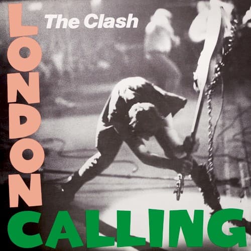
Photographer Pennie Smith's refusal to use this 'out of focus' shot was overruled perfectly.
Symbols
Smashing bass guitar
The destruction represents punk's rejection of stadium rock virtuosity and manufactured corporate entertainment.
Bent-knee stance
Simonon's athletic posture channels violence into artistic expression, freezing rage as choreographed performance art.
Blurred stage background
The motion blur isolates the bassist from his bandmates, making individual defiance universal and timeless.
Where Sound Meets Image
The explosive physicality matches an album that shattered punk's stylistic boundaries while maintaining its rebellious core. Where the three-album set ranges from reggae basslines to rockabilly twang, the cover's single decisive action provides visual unity—destruction as creation, rage as discipline. The grainy photograph mirrors the album's deliberate lo-fi production choices on tracks exploring urban decay, political disillusionment, and cultural apocalypse. Simonon's downward swing visualizes the title track's warning about rising waters and social collapse, transforming equipment destruction into prophecy.
This image established the visual grammar for punk authenticity that persists across decades of alternative rock marketing. The staged-spontaneity, the monochrome photography against pop-color typography, the performance-as-rebellion framing—countless bands from Nirvana to Green Day borrowed this visual language. Beyond music, the cover influenced fashion photography, protest graphics, and documentary aesthetics that equate graininess with truthfulness. The image proved punk could create mythology as powerful as classic rock's, replacing guitar heroes with guitar destroyers.