Style & Context
Influences
Black Flag minimalism, occult symbolism, desert landscape photography, punk flyers
Location
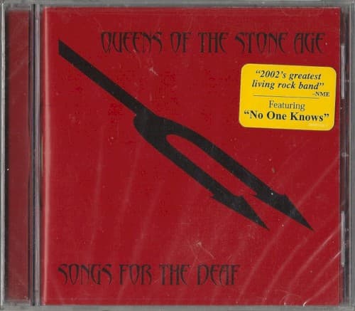
The cover reflects Palm Desert's isolation and the suffocating heat of California's stoner rock scene.
Visual Language
The design employs intentional wear and texture to suggest physical degradation from extreme conditions.
Symbols
Jagged lightning bolt
The bolt represents the album's electrical fury and the sudden violence of desert storms.
Distressed red texture
The weathered surface suggests heat-baked earth and the wear of desert highway travel.
Gothic lettering style
The ornate font evokes occult stoner rock aesthetics and heavy metal's visual vocabulary.
Where Sound Meets Image
The lightning bolt captures the album's structure as a fictional desert radio journey, where songs hit like electrical charges through static. The red intensity mirrors Dave Grohl's punishing drum work and Josh Homme's crushing riff cycles. The weathered texture reflects the concept album's road-worn narrative—a driver losing sanity while scanning stations across empty highways, with guest voices interrupting like radio DJs between sonic assaults.
This cover helped establish desert rock's visual language of heat-damaged minimalism and occult simplicity. The stark two-color approach influenced countless stoner and heavy psych releases throughout the 2000s, proving that maximum impact required minimum elements. It stands as a rejection of digital-era clutter, demonstrating that heavy music could communicate power through restraint rather than visual excess.