Style & Context
Influences
Medical imaging, architectural blueprints, Situationist psychogeography, glitch aesthetics
Location
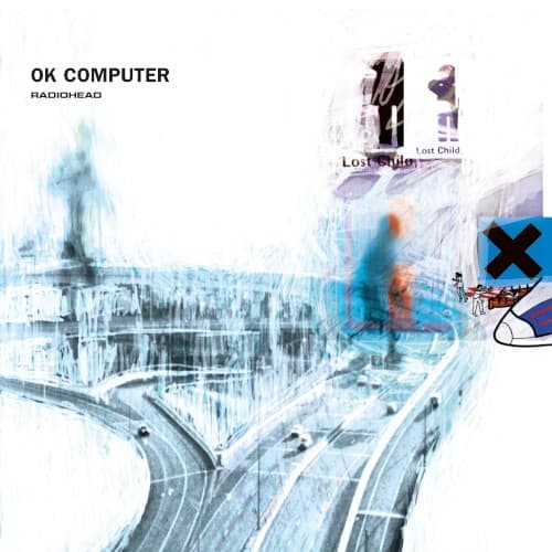
This could be any Western city's arterial system, deliberately non-specific to emphasize globalization's erasure of local character.
Visual Language
The multiple-exposure technique creates dimensional collapse, flattening physical space into disorienting digital planes that predict our screen-saturated future.
Symbols
Layered highway overpass
Modern infrastructure becomes a maze of disconnection, trapping individuals in endless circulation without destination.
Blurred human figure
The ghostly pedestrian represents identity dissolving under technological pressure and urban anonymity.
X-ray transparency effect
The see-through architecture exposes the skeleton of civilization, revealing infrastructure's cold bones beneath surface functionality.
Where Sound Meets Image
The transparent, layered visuals directly mirror the album's production aesthetic—multiple guitar and keyboard parts bleed together like the overlapping highway ramps. The ghosted human figure embodies the paranoid android, the transport motorways reflect the airbag's crash anxiety, and the overall sense of being lost in infrastructure perfectly captures 'Subterranean Homesick Alien' displacement. The cold blue palette matches the album's electronic textures invading traditional rock instrumentation.
This cover redefined rock packaging for the digital age, making transparency effects and clinical aesthetics synonymous with intelligent alternative music. Its influence appears in countless indie releases using architectural photography, multiple exposures, and desaturated palettes to signal artistic ambition. The design proved album art could visualize technological anxiety without literal computer imagery, establishing a visual language for existential dread that persists across streaming platform artwork today.