Style & Context
Influences
Bauhaus geometry, scientific textbook diagrams, op art, minimalist graphic design
Location
Hipgnosis positioned Floyd as intellectuals using stadium-scale sound to examine interior space and psychological collapse.
Visual Language
Thorgerson rejected psychedelic excess for something closer to physics class elegance, proving restraint hits harder than chaos.
Symbols
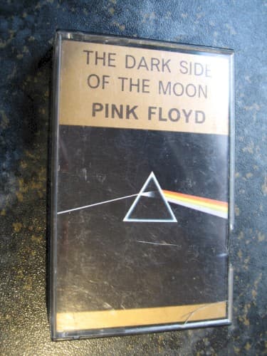
Prism triangle
Consciousness itself acts as the refractive surface that transforms raw experience into comprehensible reality.
Single light beam
Unity and sanity exist only before the splitting, before the mind processes existence into component anxieties.
Dispersed spectrum
The rainbow represents madness, time, money, and mortality as separate wavelengths of the same existential light.
Where Sound Meets Image
The prism visualizes the album's central metaphor—pressure and time refract human experience into madness, greed, mortality, and conflict. Just as white light contains all colors, 'Breathe' contains all the anxieties that later tracks examine individually. 'Money' is one wavelength, 'Time' another, 'Brain Damage' the point where the spectrum dissolves into noise. The stark geometry matches the album's clinical examination of breakdown, while the rainbow hints at the beauty and terror hidden in ordinary perception.
This became the visual shorthand for progressive rock ambition and remains instantly recognizable five decades later. Its influence extends beyond music—the prism appears on dorm room walls, tattoos, and anywhere people signal intellectual curiosity about existence. It proved that album art could be more memorable than most paintings, that simplicity executed perfectly defeats complexity done adequately. Countless bands since have attempted geometric minimalism, but few achieve this level of symbolic density compressed into such clean lines.