Style & Context
Influences
Factory signage, automotive chrome, blueprint aesthetics, industrial design
Location
The industrial aesthetic reflected working-class British rock moving away from art-school experimentation.
Visual Language
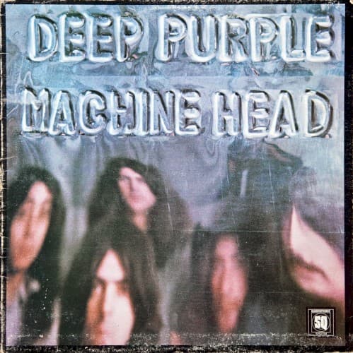
The cover merges utilitarian typeface design with documentary-style band photography for functional impact.
Symbols
Chrome block lettering
The three-dimensional metallic type suggests industrial manufacturing and heavy equipment power.
Blurred band photograph
The out-of-focus image emphasizes collective identity over individual rock star personas.
Weathered texture overlay
The worn surface treatment evokes mechanical wear, suggesting road-tested durability and working-class authenticity.
Where Sound Meets Image
The metallic typography perfectly mirrors the album's grinding riffs and mechanical precision. 'Machine Head' contains 'Smoke on the Water' and 'Highway Star,' tracks built on relentless, engine-like rhythms that the chrome lettering visually represents. The cold industrial palette matches Ritchie Blackmore's chrome-plated guitar tone and Jon Lord's Hammond organ, which together created heavy metal's blueprint. The weathered texture reflects the album's origin story — recorded in a mobile studio after the Montreux Casino fire, capturing raw performance energy.
This cover established the template for no-frills hard rock packaging that countless metal bands adopted through the seventies and eighties. The industrial typography influenced thrash and NWOBHM artwork, proving that heavy music didn't need Roger Dean fantasy landscapes or Hipgnosis surrealism. Its utilitarian approach anticipated punk's rejection of rock excess while maintaining hard rock's power. The design's influence appears in everyone from AC/DC to Metallica.