Style & Context
Influences
Situationist political posters, ransom note typography, safety signage
Location
The cover's blunt confrontation mirrors punk's King's Road and Denmark Street origins in central London.
Visual Language
The design mimics cheap commercial printing rather than fine art photography or illustration.
Symbols
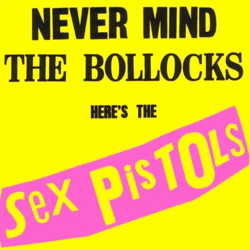
Fluorescent yellow background
The color of caution tape and safety vests mocks rock's pretensions to danger.
Diagonal pink slash
The angled band cuts across the frame like vandalism defacing polite society's walls.
Sans-serif block capitals
Industrial typography rejects the ornate psychedelic lettering of hippie rock that preceded it.
Where Sound Meets Image
The cover's visual assault mirrors the album's sonic attack on bloated rock establishment. Just as the songs reduce rock to its rawest components, the design eliminates every decorative element. The yellow screams as loud as Johnny Rotten's vocals on 'Anarchy in the U.K.' and 'God Save the Queen.' That diagonal pink slash cuts across complacency the same way the band's power chords slashed through disco and stadium rock pomposity.
This cover proved punk albums could be anti-design design, influencing decades of hardcore, alternative, and indie labels. The bold type-only approach became a template for countless punk and post-punk releases. Its fluorescent palette appeared on flyers, zines, and t-shirts worldwide, becoming punk's visual language alongside safety pins and torn fabric.