Style & Context
Influences
Aubrey Beardsley, German Expressionism, psychedelic poster art, Surrealism
Location
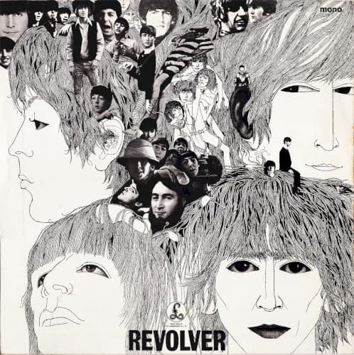
This visual emerged from Hamburg's art scene where Voormann befriended the band before Beatlemania changed everything.
Visual Language
Voormann's meticulous crosshatching creates organic textures that blur boundaries between human faces and abstract forms beautifully.
Symbols
Interwoven hair strands
The flowing linework represents the interconnected consciousness and creative synergy driving their studio experiments together.
Photographic collage within hair
Past identities and performances trapped in memory emerge from their heads like subconscious fragments.
Profile and frontal face juxtaposition
The dual perspectives suggest multiple personalities or the tension between public persona and private artistic evolution.
Where Sound Meets Image
The labyrinthine linework mirrors the album's complex arrangements and backward tape loops on tracks like 'Tomorrow Never Knows' and 'I'm Only Sleeping.' The collaged photographs emerging from hair evoke the fragmented consciousness and memory themes in songs exploring isolation, dreams, and altered states. The monochrome severity matches the album's darker emotional territory—songs about loneliness, taxation, and existential searching replace the optimism of earlier work.
Voormann's design established that album covers could be fine art worthy of gallery exhibition, earning a Grammy and influencing countless psychedelic-era illustrators. The hand-drawn approach became a template for progressive rock packaging in the 1970s, proving photography wasn't mandatory for visual impact. Its integration of typography directly into the illustration rather than overlaid as afterthought set new standards for cohesive album design.