Style & Context
Influences
Documentary photography, pop art, underground film aesthetics, commercial advertising subversion
Location
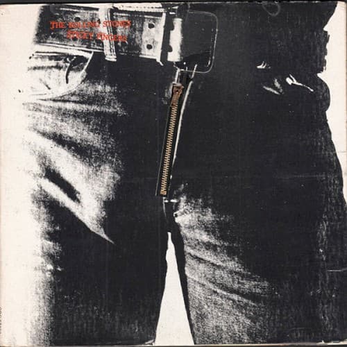
This represented the Stones shedding their psychedelic period for a grittier, more explicitly sexual brand.
Visual Language
The photographic realism combined with functional design creates fine art that doubles as tangible object.
Symbols
Denim jeans crotch
Raw masculinity and sexual confidence define the Stones' persona at their commercial peak.
Working zipper
The interactive element invites physical engagement, making viewers complicit in the provocation.
Belt and buckle
Blue-collar authenticity anchors their bad-boy image in working-class rebellion and street credibility.
Where Sound Meets Image
The stripped-down visual mirrors the album's return to blues and country roots after experimental late-sixties work. Songs like 'Brown Sugar' and 'Bitch' drip with the same sexual swagger the cover broadcasts, while deeper cuts reveal vulnerability beneath the machismo. The working-class denim connects to the rootsy, Americana-tinged tracks, grounding the band's excess in earthy authenticity. The zipper's functionality echoes the album's directness—no conceptual pretension, just tight songs delivered with maximum impact.
This cover proved rock album art could function as both fine art object and cultural provocation, inspiring countless imitations and parodies. The interactive zipper concept influenced future tactile album designs, while the sexual frankness opened doors for more explicit imagery across rock subgenres. It remains one of the most recognized and parodied covers in rock history, spawning legal battles over censorship that shaped how controversial art reaches consumers.