Style & Context
Influences
Andy Warhol, African tribal masks, Russian Constructivism, punk graphic design
Location
New York's downtown art scene where CBGB punk collided with academic experimentation and emerging world music awareness.
Visual Language
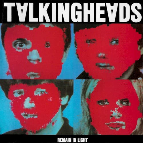
The crude registration and bleeding colors reference both xerox punk aesthetics and African textile patterns.
Symbols
Red facial overlays
The obliteration of individual identity reflects the album's themes of psychological dissolution and ego death.
Four-panel grid
The comic book layout suggests fractured consciousness and the band's embrace of mass media aesthetics.
Visible eye penetrations
Eyes breaking through the red mask hint at consciousness struggling to emerge from tribal possession.
Where Sound Meets Image
The cover's visual stutter matches the polyrhythmic layers of tracks like 'Born Under Punches' and 'The Great Curve,' where multiple time signatures overlap until individual elements blur. David Byrne's lyrics about possession and loss of control find perfect visual expression in these obscured faces. The red and blue color clash embodies the hot-cold tension between Fela Kuti's Afrobeat grooves and Brian Eno's cool electronic processing.
This cover established a template for visualizing world music fusion through cultural collision rather than exotic tourism. The distressed overlay technique influenced countless alternative rock designs through the 1980s and became shorthand for psychological depth in punk-adjacent genres. Album designers still reference this approach when depicting fragmented identity or cultural hybridity.