Style & Context
Influences
French New Wave, kitchen sink realism, Kenneth Anger, Joe Dallesandro photography
Location
The cover's European sophistication rejected both mainstream rock machismo and Manchester's working-class grittiness simultaneously.
Visual Language
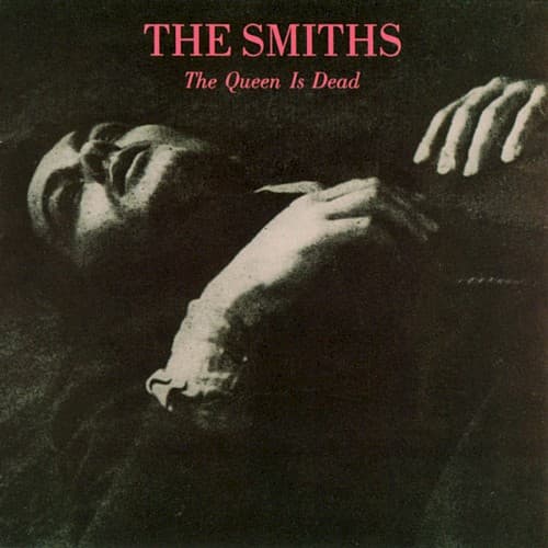
The cover repurposes Delon's heterosexual thriller into a queer visual text through context shift.
Symbols
Reaching male hand
The gesture captures queer desire rendered safe through European art cinema's coded language.
Alain Delon's reclining pose
French New Wave masculinity becomes a shield for expressing homoeroticism in 1980s Britain.
Disconnected bodies in frame
Physical separation mirrors the emotional isolation threading through every song on the album.
Where Sound Meets Image
The album's opening scream and crashing guitars contrast sharply with this quiet, intimate image—yet both express desperate emotional intensity. Morrissey's lyrics obsess over unattainable desire and class frustration, precisely what this frame of unrequited reaching communicates. The French cinema reference parallels how songs like 'Cemettery Gates' name-drop Keats and Yeats—positioning pop music as a vehicle for literary and visual culture. The grainy, vintage quality mirrors Johnny Marr's backward-looking jangle that somehow sounded completely modern.
This cover established that indie bands could build visual identities through film appropriation rather than band photography or illustration. Morrissey's subsequent solo career continued raiding cinema archives, but none matched this cover's perfect synthesis of image and provocation. The aesthetic influenced countless indie bands who ditched photoshoots for archival imagery, from Belle and Sebastian to The Libertines.