Style & Context
Influences
2001: A Space Odyssey, Brutalist architecture, documentary realism, British New Wave cinema
Location
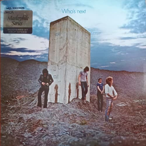
The image captures rock's shift from countercultural idealism to knowing, self-aware spectacle.
Visual Language
The composition uses wide-angle perspective to dwarf the figures against inhuman scale.
Symbols
Concrete monolith
The towering slab represents technology and industry looming over human nature and spontaneity.
Barren quarry landscape
The stripped earth symbolizes spiritual desolation in the modern technological age.
Act of urination
Defiant biological necessity mocking pretentious art and commercial conformity with punk irreverence.
Where Sound Meets Image
The stark minimalism mirrors Pete Townshend's synthesizer experiments, replacing guitar bombast with mechanical precision and spacious arrangements. The desolate setting reflects 'Baba O'Riley' and 'Won't Get Fooled Again' addressing disillusionment with revolution and technology's failed utopian promises. The crude humor balances the album's philosophical weight—these aren't distant artists but working musicians literally relieving themselves, grounding cosmic themes in bodily reality.
The cover established that major rock acts could use deliberately ugly, confrontational imagery and still achieve commercial success. Its influence appears in punk's anti-aesthetic, from Sex Pistols' provocations to Nirvana's casual irreverence. The monolith became shorthand for technology's dehumanizing presence, referenced across decades of alternative rock art.