Style & Context
Influences
Abstract expressionism, Nan Goldin's intimate photography, Andy Warhol's color treatments
Location
This aesthetic defined the introspective turn in alternative rock as the rave generation embraced sensory overload.
Visual Language
The technique prioritizes emotional resonance over clarity, mirroring how the band buried melodies under effects.
Symbols
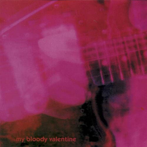
Blurred human figure
The obscured person represents identity dissolving into pure sensation and sound texture.
Out-of-focus guitar
The barely visible instrument symbolizes how traditional rock tools become unrecognizable through effects processing.
Lens flare streaks
Light artifacts mirror the album's studio techniques that embrace imperfection and sonic bleeding.
Where Sound Meets Image
The visual blur directly translates Kevin Shields' production philosophy—burying conventional song structures under tremolo bar abuse and reverse reverb until melody becomes texture. Just as the cover forces viewers to work at perceiving the figure and guitar, tracks like 'Only Shallow' and 'To Here Knows When' make listeners strain toward buried hooks through feedback. The pink wash evokes the album's surprising warmth despite its noise, how Bilinda Butcher's vocals float like the pale shape in this image—present but untouchable, familiar yet alien.
This cover established shoegaze's visual language as effectively as the music defined its sound, proving album art could reject clarity without sacrificing beauty. Subsequent bands from Slowdive to contemporary acts like Nothing adopted similar soft-focus, color-saturated aesthetics, understanding that abstraction could communicate more than literal imagery. The design influenced indie rock's move away from posed band photos toward impressionistic art that prioritized mood.