Style & Context
Influences
Anatomical textbooks, Vesalius engravings, punk art, DIY zine aesthetics
Location
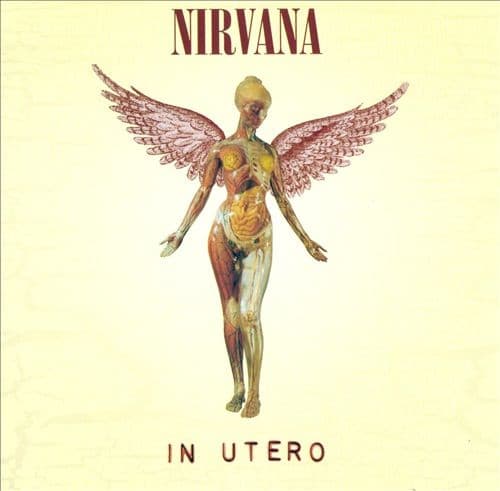
The anatomical brutality aligned with Seattle's underground noise rock scene rather than MTV-friendly alternative rock.
Visual Language
The medical illustration style deliberately alienates viewers with its unflinching biological detail and antiseptic presentation.
Symbols
Transparent anatomical body
The exposed organs represent Nirvana's deliberate rejection of commercial polish after Nevermind's success.
Angel wings on medical figure
The collision of sacred imagery with clinical anatomy mirrors grunge's fusion of beauty and disgust.
In Utero title placement
The womb reference combined with the transparent body suggests themes of birth, vulnerability, and prenatal existence.
Where Sound Meets Image
The exposed anatomy mirrors the album's production philosophy—Steve Albini's raw recording captured unvarnished performances without the studio gloss Butch Vig applied to Nevermind. Songs like 'Rape Me' and 'Tourette's' operate with the same visceral intensity as the cover's medical frankness. The angelic wings suggest the album's quieter moments like 'Dumb' and 'All Apologies,' where beauty emerges from the ugliness. The womb imagery connects directly to tracks exploring birth, death, and bodily autonomy.
The cover established a template for post-grunge artists to embrace provocative, anti-commercial imagery that challenged major label expectations. Its medical aesthetic influenced alternative rock packaging throughout the mid-90s, proving bands could maintain artistic integrity on corporate labels. The image remains one of rock's most recognizable rejections of conventional album art, frequently censored in retail chains yet reproduced across countless bootlegs and tribute albums.