Style & Context
Influences
Brutalist architecture, institutional design, punk DIY aesthetics, conceptual art
Location
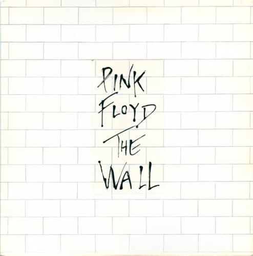
The sterile surface reflects Thatcher-era Britain's concrete housing estates and the growing disconnect between rock stars and fans.
Visual Language
The design rejects prog rock's typical fantasy escapism for confrontational architectural realism that makes viewers complicit in the isolation.
Symbols
White brick wall
The barrier represents emotional isolation, class division, and the protective walls people build against trauma and society.
Hand-drawn lettering
The crude scrawl suggests graffiti protest against institutional control, humanizing an otherwise inhuman surface with desperate individual expression.
Mortar lines
The precise grid pattern embodies conformity and the systematic structures that crush individuality throughout the album's narrative.
Where Sound Meets Image
The blank wall perfectly mirrors the album's themes of isolation, mental breakdown, and barriers between performer and audience. Roger Waters conceived the work after spitting on a fan, and this impenetrable surface visualizes that moment of complete disconnection. The wall builds throughout the album—brick by brick in the lyrics—making the cover a literal representation of the concept. The crude handwriting suggests the scrawled thoughts of someone institutionalized, matching Pink's mental collapse. Unlike the elaborate gatefold art inside, this outer barrier forces listeners to break through to reach the story within.
This cover proved minimalism could be more powerful than prog's typical elaborate art, influencing countless bands to strip their visuals to conceptual essentials. The design's refusal to show the band or any imagery became a template for concept albums prioritizing ideas over personalities. Its architectural brutality inspired post-punk and industrial bands to embrace institutional aesthetics. The wall itself became rock's most recognizable symbol of alienation, spawning the massive stage show with its literal construction and destruction, and the film's expansion of this visual language.