Style & Context
Influences
Modernist abstraction, Stanley Donwood, Kandinsky, digital glitch aesthetics
Location
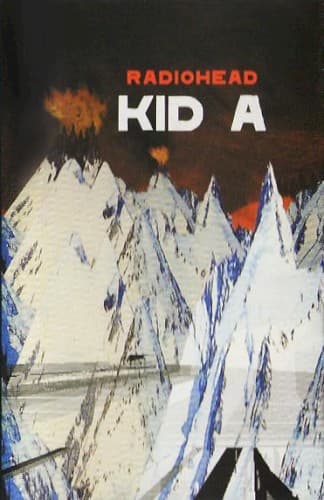
The barren landscape echoes the emotional geography of late-stage capitalism and pre-9/11 unease.
Visual Language
The cover blends traditional painting gestures with digital manipulation to create deliberately unstable terrain.
Symbols
Jagged white mountains
The fractured peaks represent the fragmented psyche navigating Y2K-era technological dread and isolation.
Abstract painterly treatment
The non-photographic approach signals Radiohead's deliberate break from traditional rock band imagery and expectations.
Absence of human figures
The unpopulated landscape reflects Kid A's themes of disconnection, anonymity, and post-human electronic futures.
Where Sound Meets Image
The fractured, abstract landscape directly mirrors the album's fragmented song structures and processed vocals. Just as the mountains resist easy navigation, tracks like 'Idioteque' and 'Everything In Its Right Place' refuse traditional verse-chorus-verse paths. The cold whites and blues visualize the album's icy synthesizers and distant production, while the volcanic orange hints at the human anxiety buried beneath electronic surfaces. The absence of band photos matches Kid A's rejection of rock-star personality in favor of anonymous electronic textures.
The Kid A cover helped legitimize abstract, non-photographic art in rock packaging during an era dominated by band portraits and literal imagery. Its painterly aesthetic influenced countless indie and electronic acts to embrace visual ambiguity. The cover's refusal to explain itself mirrored the album's challenging listening experience, proving major-label rock could still prioritize artistic mystery over commercial accessibility.