Style & Context
Influences
fantasy art, science fiction paperbacks, psychedelic poster art
Location
The fantasy world aesthetic separated prog from blues-based rock, signaling cerebral ambitions over raw emotion.
Visual Language
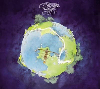
Dean's soft-focus airbrush technique creates dreamlike atmosphere that perfectly matched prog's ethereal ambitions and technical precision.
Symbols
Fractured planet
The shattered sphere represents the album's suite-like structure where individual pieces form a greater whole.
Single ship in atmosphere
The tiny vessel symbolizes human imagination navigating vast musical and conceptual territories beyond conventional rock.
Weathered landmass edges
The eroded coastlines suggest ancient worlds and timeless themes that prog musicians sought to explore.
Where Sound Meets Image
The planet's fragmentary structure mirrors how Fragile alternates full-band pieces with solo showcases from each member. The organic shapes reflect Bill Bruford's fluid drumming and Chris Squire's melodic bass, while the cosmic scope matches Jon Anderson's mystical lyrics and Rick Wakeman's classical keyboard flourishes. The cover's peaceful beauty captures the album's accessible melodies despite intricate arrangements, making prog's complexity inviting rather than intimidating.
Dean's work for Yes spawned an entire cottage industry of fantasy rock art and established that prog albums required visual worlds as elaborate as their soundscapes. His airbrushed planets appeared on dorm room walls worldwide, becoming as recognizable as the music itself. Countless bands hired fantasy illustrators to chase this aesthetic, making the style synonymous with artistic ambition in rock through the mid-seventies.