Style & Context
Influences
Robert Frank street photography, concert documentation, 1950s rock portraiture
Location
The stark presentation reflects post-Vietnam, post-Watergate disillusionment channeled through Jersey shore grit.
Visual Language
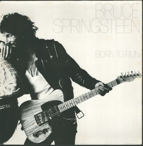
Meola's composition borrows from documentary tradition while capturing performance energy in a studio setting.
Symbols
Fender Telecaster positioned low
The guitar slung below the waist signals working-class defiance and accessibility over virtuoso showmanship.
Leather jacket and casual stance
Street-level authenticity rather than rock star glamour defines the visual language here.
Body caught mid-motion blur
Perpetual movement embodies the album's central theme of escape and restless American dreaming.
Where Sound Meets Image
The blurred motion captures the album's relentless forward momentum—songs like 'Born to Run' and 'Thunder Road' are built on escape velocity and highway desperation. The absence of color matches the stark emotional honesty in lyrics about dead-end towns and last-chance romance. Where the Wall of Sound production creates density and drama, the cover's negative space suggests the open road and possibility beyond the frame. The solitary figure with guitar distills the album's core tension between individual dreams and crushing circumstance.
This cover established the template for heartland rock presentation—no gimmicks, just the artist and their instrument. Its influence appears in everyone from Tom Petty to The Gaslight Anthem, proving that authenticity could be a visual strategy. The typography style became shorthand for blue-collar rock credibility, copied endlessly but rarely matched. Decades later, the image still defines how rock photography can convey urgency without artifice.