Style & Context
Influences
New York street photography, Pop Art window concepts, architectural documentation
Location
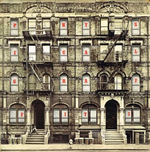
St. Mark's Place housed counterculture shops, punk clubs, and immigrant families in a mix Zeppelin channeled into sonic diversity.
Visual Language
The innovative die-cut design transforms a static photograph into an interactive object that reveals different images through the windows.
Symbols
Die-cut windows
The apertures function as portals between reality and fantasy, suggesting multiple dimensions within a single structure.
Fire escape zigzags
The metal stairs trace escape routes from convention, mirroring the band's refusal to remain confined by genre.
Weathered brick facade
The aged surface suggests durability and authenticity, positioning Zeppelin as architects of enduring rock rather than fleeting fashion.
Where Sound Meets Image
The building's vertical structure mirrors the album's ambitious scope, with each window suggesting a different sonic room to explore. Just as the fifteen tracks range from Delta blues to Eastern-influenced experimentation to hard-driving rock, the windows hint at multiple realities coexisting within one frame. The aged exterior reflects the vintage blues and folk influences Zeppelin mined, while the die-cut innovation parallels their studio experimentation. The physical presence of this actual location grounds songs like 'Custard Pie' and 'Trampled Under Foot' in tangible urban energy rather than abstract concept.
The die-cut window concept established interactive album packaging as legitimate artistic expression, influencing decades of deluxe edition design. The cover's architectural approach inspired countless rock bands to use buildings and urban landscapes as metaphors for musical structure. Its blend of documentation and artifice created a template for presenting rock music as both street-level authentic and conceptually sophisticated, proving album art could match the ambition of a double-LP without resorting to fantasy illustration.