Style & Context
Influences
Mick Rock portraiture, Warhol screen tests, German Expressionist cinema
Location
The cover emerged when Queen was pushing beyond glam rock's costume party into something stranger and more psychologically complex.
Visual Language
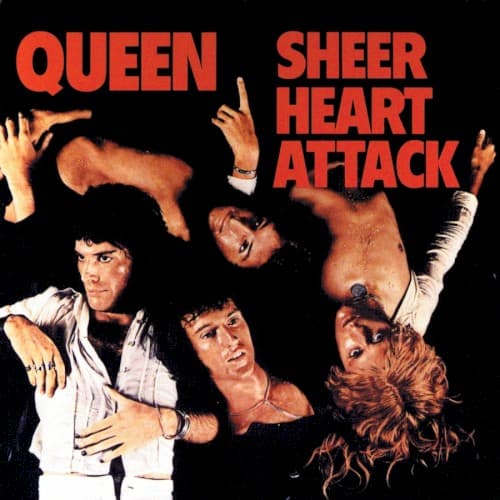
The lighting isolates each figure while creating a unified composition of overlapping limbs and faces.
Symbols
Inverted body positions
The band literally turns rock posturing upside down, rejecting standard power poses for theatrical collapse.
Exposed torsos and reaching hands
Physical vulnerability becomes a form of aggression, challenging glam rock's usual armor of costume.
Direct eye contact amid chaos
Multiple band members stare at the viewer despite contorted positions, maintaining confrontational control.
Where Sound Meets Image
The contorted bodies mirror the album's compressed structures and sudden dynamic shifts—songs that explode from whisper to scream without warning. The vulnerability in the image reflects lyrics exploring emotional breakdowns and obsessive relationships. The theatrical arrangement matches the production's dense layering, where multiple vocal and guitar parts interweave like the overlapping limbs. The black void represents the stripped-down aggression of harder tracks while the exposed flesh connects to the album's more emotional ballad moments. The cover promises physical intensity that the music delivers through Brian May's layered guitar assault and Freddy Mercury's multi-octave vocal acrobatics.
This cover established Queen's visual identity as theatrical provocateurs willing to abandon rock's standard masculine presentation. The dramatic studio photography against pure black influenced countless metal and hard rock covers that followed, though few matched its psychological complexity. The image's collision of vulnerability and aggression anticipated punk's rejection of rock star untouchability while maintaining glam's commitment to spectacle. Modern band photography still echoes this template—using stark backgrounds and physical contortion to suggest intensity rather than relying on props or location. The cover proved that literal vulnerability could project more power than traditional rock posing, a lesson absorbed by everyone from Muse to My Chemical Romance.