Style & Context
Influences
Robert Frank, Weegee, underground zines, vintage postcard collections
Location
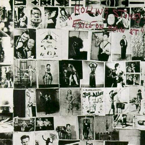
This collage captures the Stones' deliberate embrace of American roots music during their tax exile period.
Visual Language
The deliberately rough paste-up aesthetic rejects the slick photography dominating early seventies rock packaging.
Symbols
Burlesque and cabaret performers
These figures represent the sexual rawness and carnival atmosphere that permeates the album's lyrical world.
Mugshots and police imagery
The presence of law enforcement visuals underscores themes of outlawry and the band's relationship with authority.
Circus freaks and sideshow acts
These images mirror the album's fascination with outcasts, misfits, and the margins of American society.
Where Sound Meets Image
The chaotic visual sprawl perfectly matches the album's loose, multi-genre approach to rock. Just as the music careens from gospel to country to blues without polish or apology, the cover refuses any single focal point or narrative. The vintage imagery connects directly to songs mining American roots traditions, while the seedy cabaret photos evoke tracks like 'Tumbling Dice' and 'Rip This Joint.' The degraded visual quality mirrors the basement-recorded sound, where instruments bleed together in glorious mud.
This cover established that major rock releases could reject commercial slickness entirely. Its collage approach influenced countless punk and alternative records, from the Clash's scrapbook aesthetics to indie rock's embrace of lo-fi design. The anti-design became its own design language, proving that authenticity could be constructed through carefully chosen grime.